As a creator of web and desktop applications, you are often faced with the issue of how best to display your application’s data in a manner that is effective and professional. Sometimes the challenge is how to display a large amount of data. Alternatively, your goal may be to present the data in the form of a well formatted, print-ready report. Finally, it may be a matter of showing the most recent data in a manner that gives it context and helps to prioritize what is most critical. JClass provides a number of options to help create the best solutions to address these issues.
Using Charts and Graphs
When presenting data to end users, one of the most effective ways to show patterns and relationships between sets of data is to use charts and graphs. These visualizations are particularly useful when presenting data that are too numerous or complicated to be described adequately by text and can be significantly more compact. Visualizing the data properly with a chart or a graph can highlight the most important information, help provide new insights, make predictions based on trends, and can indicate actionable tasks such as where to focus resources.
Being able to choose the right format and presentation for data will make a huge difference as to how that data is perceived. Simply defaulting to one type of visualization can cause confusion, so selecting a tool that generates a variety of options is important. You may want to show composition, such as the breakdown of sales by region, in which case a pie chart or bar graph might be the most useful form factor.
Examples of JClass pie charts and bar graphs
Alternatively, you may want to analyze trends or the relationship between values, such as showing the relationship between customer satisfaction and how much revenue is generated by a customer, in which case a scatter plot may be more appropriate.
Examples of JClass plot and scatter plot charts
You may even have special needs such as displaying a timeline (e.g., for a Gantt chart), showing financial data (using Hi-Lo or candle bars), or dealing with multivariate data (such as with polar charts). Also, in order for the meaning of the data to be clear, any graphs being rendered should be properly labeled on its axes, have its scales marked, and provide legends clearly explaining shading and different categories.
Additional Examples of JClass charts — hi-lo/candle, timeline and polar
Generating Reports
In addition to displaying these graphics as part of a web page, it may be important to generate files such as PDFs to present this data. In this case, control of the layout and formatting of data and text in this sort of report becomes a primary concern. In addition to the flow of text and other elements that are generated, layouts should include any “front matter” elements such as a title page, table of contents, acknowledgements, lists of other content, and the preface.
Precise control over colors, fonts, headings, spacing, indentation, and alignment is necessary to create documents that conform to style guidelines for other documents produced by an organization. In order to respect any confidential or proprietary information contained in these reports, it’s important to allow generated files to be secured by making them password protected or prevent them from being either printed or modified. Applying other security or branding elements such as watermarks may also be necessary.
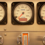
Finally, there may be a “real time” aspect of the application data being displayed, so it’s useful to be able to generate graphics that show information as a status in a dashboard format. The term “dashboard” refers to an information management tool that displays key metrics and performance indicators so they can be monitored and tracked in a centralized and often user configurable way. Dashboards can be the most efficient way to aggregate and track multiple data sources as that data becomes available.
Displays within a dashboard, or gauges, may be either a simple status indicator or may use a scale for context (such as an odometer or a thermometer). Being able to customize gauge components you create such that they resemble real world devices with which users are already familiar helps them learn a tool more quickly and intuitively. Combining how these sorts of gauges are displayed by layering them on top of each other allows for interfaces that are compact, with relevant information closely associated visually.
Examples of indicators and scale based gauges created with JClass components
Use JClass Components to Present Your Data
JClass is a 100% fully customizable Java solution for presenting your data for Java-based desktop and server Applications. This tool provides options to address all these approaches that designers and developers will want to leverage when creating their applications. JClass has both ServerViews and DesktopViews programs, which each have different elements.
JClass Chart and JClass ServerChart are charting/graphing components that can be used to generate clear and consistent images for client and server-side applications in a variety of form factors to meet your data display needs. JClass ServerChart Designer is a WYSIWIG graphical interface to design the layout of these charts.
JClass ServerReport and the corresponding client component JClass PageLayout offer a robust set of options for creating formatted, paginated, print-ready reports. JClass ServerReport Designer will allow you to create a page template, text styles templates, as well as a whole document.
JClass Gauge is a set of GUI components that you can use to add gauge style instrumentation to your user interface. JClass ServerGauge provides classes for the corresponding server based functionality.
Additional components include JClass Elements, a broad collection of GUI components and utility classes designed to augment Swing’s basic offerings, and JClass LiveTable, a Java GUI component that displays rows and columns of user- interactive text, images, hypertext links, and other Java components in a scrollable window.
JClass components are written in Java, making the code portable when it comes to developing client side applications and compatible with one of the most popular server side technologies for creating web applications. The components are built with clear class and containment hierarchies as well as the ability to accept data from multiple sources such as XML and JavaBeans. The code base is also designed to be internationalized and localized, meaning they are ready to be used in world class applications.
Overall, JClass provides a powerful set of options for presenting your data to end users in a way that is both consistent and professional looking in a manner that is the most suitable for the type of data being presented.
If you are a current customer using JClass and you have an active support warranty, we’re offering a free JClass upgrade. Save yourself the trouble of upgrading to a new software and try JClass. Our dedicated support team of JClass experts is available to help with technical issues or with any questions you may have about JClass. Contact us to learn more and get your free upgrade.